Quip City Designs
I illustrated branded stickers for each city our sales reps would be traveling to. We sent these out with a suitcase. Introducing a "fun," "collectible" element, incentivized our teams to travel, sell, and "show off" where they had been and sold to. We also sent these stickers to customers, offering customization, and personalization, showing them that Quip cared about them personally. The globalization that this campaign demonstrated, reflected the "anywhereness" of Quip as a product.


Quip Emails


Redesigned the Quip email template to reflect our new branding, increase open-rate and clicks, and time spent in the email.


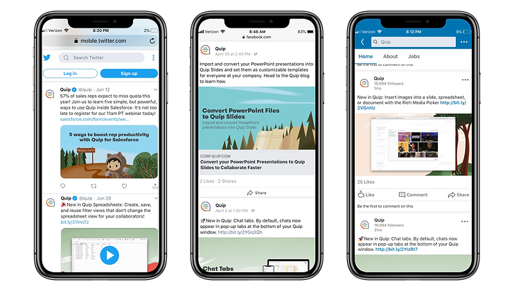
Quip Social Media
Highlighting our new illustration style, and decreasing copy-use in our social media, called more attention, and stood out in user's social feeds. Creating digestible content and graphics increased traffic, and clicks.


Quip Social Media
Focusing on graphics, and short headlines allowed out ads to quickly communicate our offerings/features. We used nature illustrations to convey the "anywhere-ness" of our product, and mountain imagery to demonstrate teamwork, and accomplishment.


Quickbase University Homepage
The purpose of redesigning the new Quickbase University homepage was to both incorporate our new illustration style, and also to make courses, paths, and trainings, more accessible and navigable.

Quickbase Product Abstractions
I abstracted all of Quickbases' product screenshots, so that they aligned with our brand, while still communicating the important product features.

